


CSS layout properties like inline, block, and inline-block determine how elements are displayed on the page. Whether you're designing a website or tweaking a layout, understanding the difference between these display types is important. Let’s break them down step by step and see how each of them affects your design.
What Are Inline, Block, and Inline-Block?
In CSS, the display property defines how an element will behave in terms of size, position, and how it interacts with other elements around it. The three most common values for the display property are inline, block, and inline-block. These values control how elements behave on the page.
1. Block Elements: Full Width, New Line
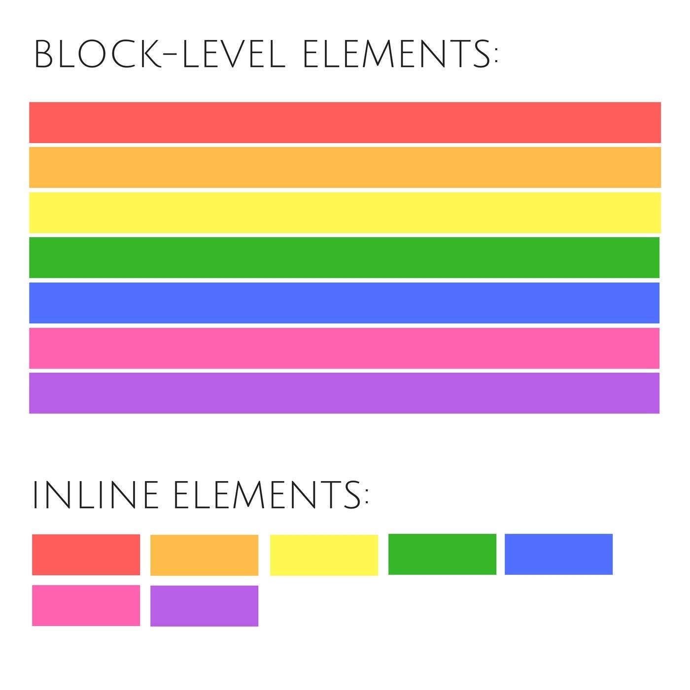
Block elements are the building blocks of layouts. These elements take up the full width of their container and always start on a new line, creating a clear separation between different sections of content.
How Block Elements Work:
Block elements take up the entire width of their parent container, stretching from the left to the right edge, regardless of their content size.
They force a line break before and after themselves, ensuring that no other elements appear on the same line, which helps in organizing content into distinct sections.
You can set the width and height of a block element, allowing for precise control over the layout and size of these elements.
Common block elements include
<div>,<p>,<h1>,<section>, and<article>, which are used to structure the main parts of a webpage, such as headers, paragraphs, and sections.
Example of a Block Element:
div {
  display: block;
  width: 100%;
  height: 100px;
  background-color: lightblue;
}
Explanation: A <div> will take up the entire width of its parent container and create space for other elements beneath it. You can also set the height.
When to Use Block Elements:
You need sections that stretch across the full width of the container, like divs for layout, paragraphs, and headings.
You want clear separation between content.
2. Inline Elements: Content-Only, No Line Break
Inline elements work differently from block elements. They only take up as much width as they need based on their content and do not force line breaks, allowing them to flow within a line of text seamlessly.
How Inline Elements Work:
Inline elements only take up as much width as necessary (i.e., the width of their content), which means they fit snugly around the text or content they contain.
No line break occurs before or after inline elements, allowing them to sit alongside other inline elements or text within the same line, maintaining the natural flow of content.
You cannot set the width or height of inline elements, as they are designed to adapt to the size of their content automatically.
Common inline elements include
<span>,<a>,<strong>, and<em>, which are often used to apply styles or links to specific parts of text without altering the overall layout.
Example of an Inline Element:
span {
  display: inline;
  color: red;
}
Explanation: The <span> will be part of the text flow and won’t start a new line. It can sit next to other inline elements or text.
When to Use Inline Elements:
You need to style specific parts of text without disrupting the flow.
Inline elements are great for modifying parts of content like links, bold text, or inline images..
3. Inline-Block Elements: A Hybrid of Both
Inline-block elements combine the best of both worlds: they behave like inline elements (sitting next to each other) but allow you to set width and height like block elements.
How Inline-Block Elements Work:
They allow you to set width and height, similar to block elements, providing more control over the size and layout of the elements.
They don’t force a line break and can sit next to other inline or inline-block elements, maintaining a seamless flow within a line.
Common use cases include creating horizontal menus, aligning boxes, or placing images in rows, where you need both alignment and size control.
Example of an Inline-Block Element:
.box {
  display: inline-block;
  width: 150px;
  height: 100px;
  background-color: lightgreen;
  margin: 10px;
}
Explanation: The .box will be placed next to other inline or inline-block elements, but you can control its size (width and height).
When to Use Inline-Block Elements:
When you want to align multiple elements horizontally but also need to control their size.
For elements that need both layout control and inline behavior, such as image galleries, navigation menus, or product cards.

Summary:
Block elements take up the entire width of their container and always start on a new line. Use them when you want full-width sections or paragraphs.
Inline elements only take up as much width as their content and don’t break the line. Use them for small chunks of text, links, or styling parts of text.
Inline-block elements combine inline behavior (sitting next to other elements) with the ability to set width and height. Use them when you need alignment but still want to control the size of the elements.
In Simple Terms:
Block: Takes up the whole line, like a big box.
Inline: Stays within the line, like a word in a sentence.
Inline-block: Stays in the line but can be sized like a box.

By understanding the differences between these display types, you can better control your layout and create cleaner, more efficient designs in your web development projects.